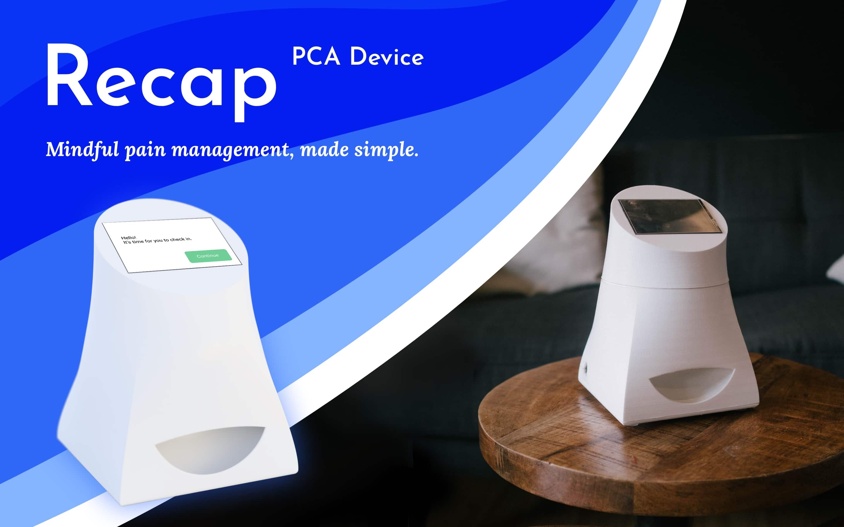
Recap PCA is my senior capstone project completed with Seattle Children's Hospital and the outstanding help of my three other capstone team members: Jill Aneri Shah, Mackenna Lees, and Ostin Kurniawan. This project could not have been completed by any of us alone or without the talents of any one person.
Seattle Children's Hospital gave us a challenge: bring hospital-quality pain control into the homes of people who would typically be prescribed opioids for a recovery period. With the opioid crisis in mind, we considered this an important project to devote our final project in HCDE to. PCA (patient controlled analgesic) devices are typically used in hospitals to manage patient pain. Generally considered a safe way to deliver opioids, they give users control over their pain management yet also provide safe limits on patient dosing, dramatically reducing the likelihood of overdose or dependency formation. We sought a solution that took appropriate cues from hospital PCA devices and took them to users’ homes. Our goal and the device’s purpose is to help users manage their pain mindfully while reducing any anxiety users may have about taking opioid-based medication.
We began the project by thoroughly researching the problem space by gaining an understanding of existing solutions, research in the field, and talking with people (aged 20–75) who had been prescribed and taken opioids. From our research, we learned about the many needs of people recovering from painful operations, accidents, and more. We also learned about the many options on the market and noted ideas that could help us in our approach and complexities or features we wanted to steer clear from, such as app-based reminders and scheduling. This milestone concluded in a set of design requirements that guided the rest of our work.
Following from this, we designed an initial user flow that became the guiding, fundamental document for our project. We included all text strings for the interface in this asset as well since the phrasing of options and feedback is so critical to the user experience of this device. We also used this as a clear way to communicate with each other and our sponsors who could inform our decisions to this point.

This informed a high-fidelity prototype of our user flow we created with Figma. Meanwhile, we recruited a set of usability test participants to gather feedback from. These testers were aged 20 to 75. Some of our testers had experience taking prescription painkillers and others had no experience. Both sets of usability testers were helpful in assisting our research since a good solution ought to fit the needs of someone who has specific preferences regarding how they want to take their medication and someone who may want a more guided experience. By the end of our usability testing, we had conducted tests with ten participants.

After this work, we processed our learnings from the usability studies and sponsor feedback so we could begin a series of rapid prototyping sessions. These sessions were an opportunity to trial different casing design and dispenser mechanism ideas. No person on the team had experience with mechanical engineering so designing a physical product was a great learning experience for all involved. After prototyping with cardboard, we modeled our dispenser and case designs parametrically in Autodesk Fusion 360 and used 3D printers to bring the designs to life and ensure they not other functioned (which took a great deal of effort in its own right) but also formed an attractive, usable prototype device. Even our highest quality prints could not be as perfect as an injection molded part but they served to validate our designs and communicate with our sponsors and future researchers on possible routes for the device's form factor and dispensing mechanism.
Take a look at my full process book to see more about Recap and my work on the project: View Process Book.
