Career Canvas is a startup looking to help aspiring and experienced people reach their job goals by providing professional writing and career coaching services. At an early stage, I was asked to come on board and design a complete brand identity and style guide for the company in addition to web design and front-end development. Each stage of the design process brought unique challenges and helped me grow as a designer and a learner.
Throughout this project, a consistent challenge and growth area was communication. In my previous experience, I've worked primarily with designers and developers or business people who are very familiar with design and development processes. In this case, the client I worked for was a newcomer to both fields. The client brought solid business development and marketing understanding but required help understanding design and technology needs. I learned early on that I needed to help the client understand the value of my work and the design process. This had the side effect of helping me refine and better understand the work I was doing too.
Branding
When starting with the branding process, I began by interviewing the client. I asked them what brands they liked, about the businesses primary competition, about what they wanted visitors to feel when seeing the branding, and what they wanted associated with the brand. These questions gave me additional clarity regarding the client's expectations and clear up any initial misconceptions about what the branding should accomplish.
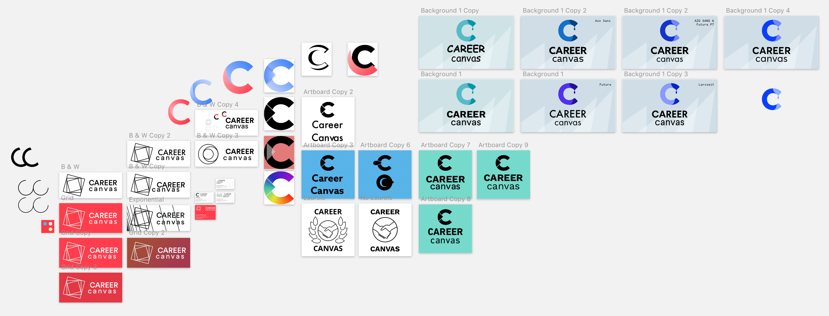
In the early parts of this process, I sketched a series of different concepts for the brand's mark or icon and iterated on the most promising ones. I had to stay away from marks that only relied on Career Canvas's initials because of the many prominent brands that already take that form (e.g. Chanel). Instead, I started with some very abstract marks but found those did not achieve the goal of communicating with people who were unfamiliar with the company.
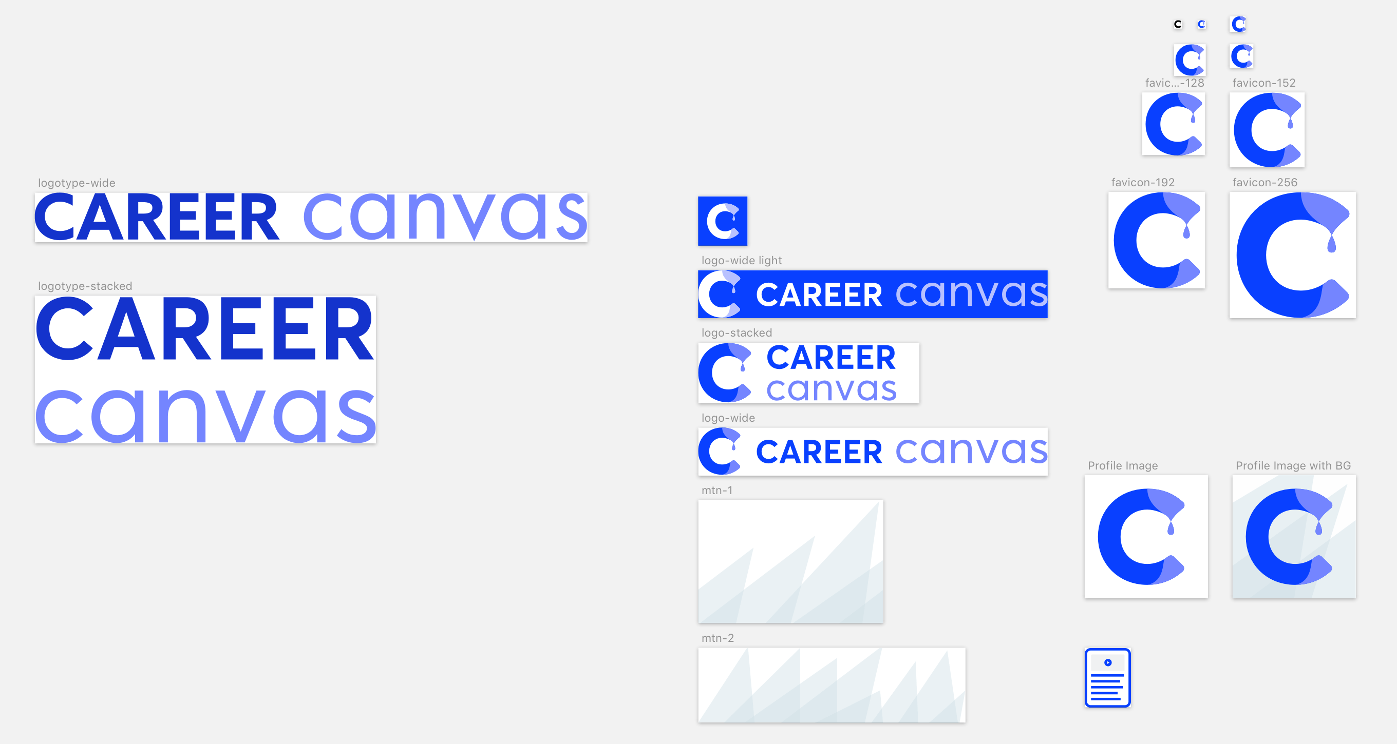
After dozens of iterations, we settled on a mark that represented the artistic aspect of the brand. Importantly, the mark works in a wide variety of situations with and without accompanying logotype, as shown below. The mark can be used in greyscale, on a light background, and on a dark background.

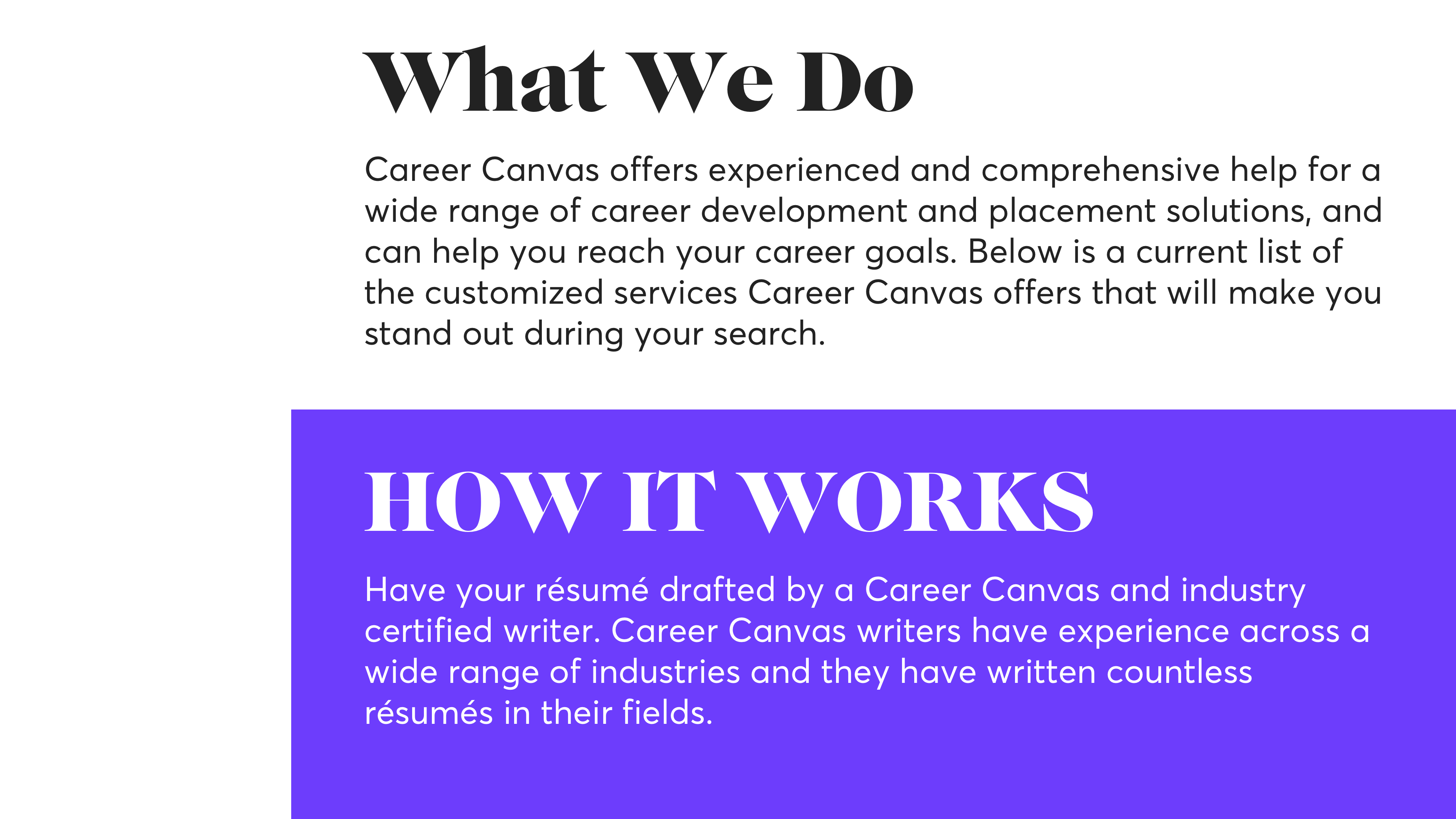
After settling on the mark, I continued to build a design system for the rest of the brand. This took the form of a formal style guide that covered the logo's form and usage, typography, and brand colours. This includes the mountain pattern above, which would be horizontally tiled for use on the web or in other digital and print mediums. I spent a good deal of time learning about and working through strong typography for the brand. I searched for modern, serif headings typefaces and geometric sans-serif body typefaces that were visually complementary. The typeface pairing I selected, however, was not received well by the client, but we were able to agree upon just utilising Averta, the body typeface, across all typography for the brand.
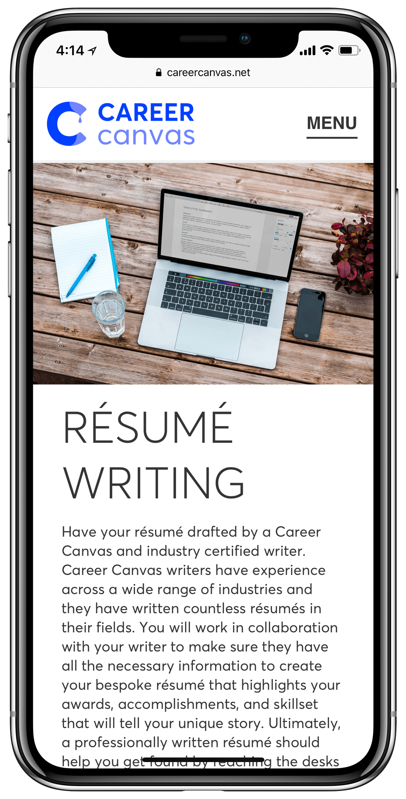
Web Design
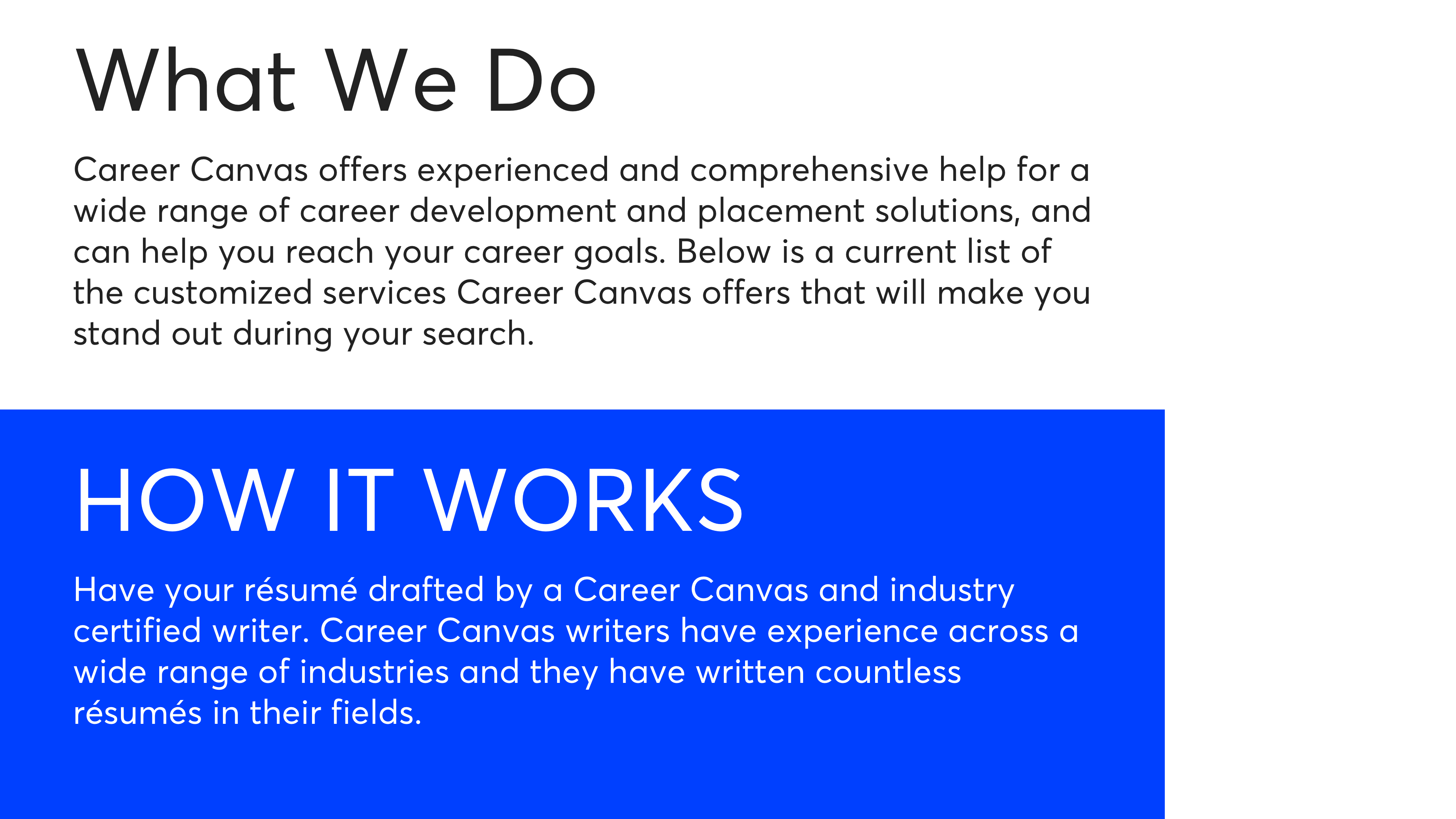
With the design system mostly completed, I found the site design came together quickly. In fact, I was able to design and build the initial version of the global components of the site including the header and footer as well as the homepage in only a few hours. With the design system underpinning the site's design, it was easy to quickly build pages of the site and interfaces for users, writers, and admins to track orders, respond to tickets, and update account information.
I ensured the site is fully accessible for users navigating with keyboards and screen readers. Thanks especially to Heydon Pickering's Inclusive Front-End Design Patterns for inspiration and reference to this end. The entire website is also optimised for HTTP/2, with styles and scripts properly split for each page.
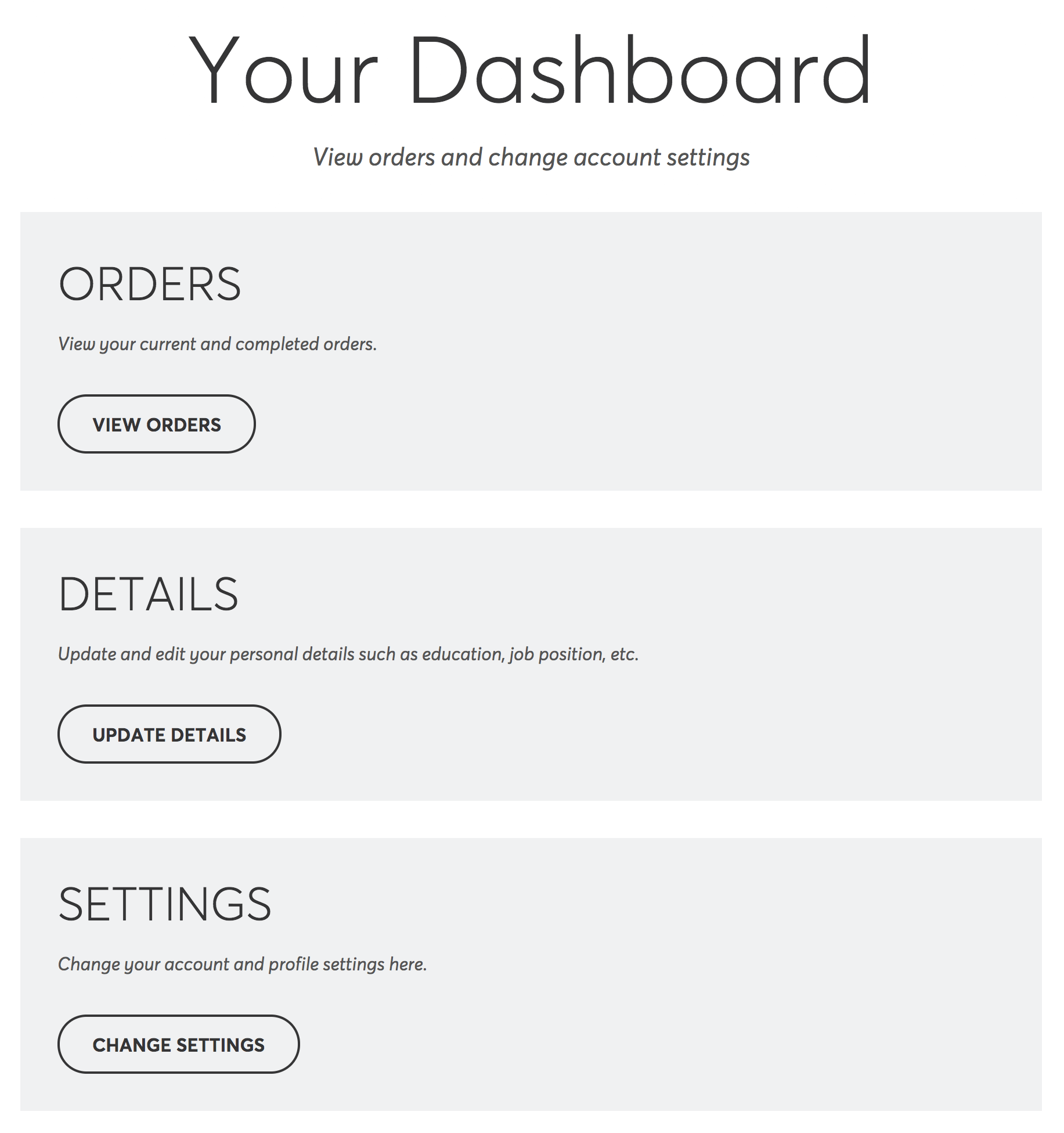
Rather than be an afterthought, the registered customer experience was also a focus of mine. Ensuring customers had a clear dashboard where they could review their order, change personal details, and respond to tickets is just as important as making sure the checkout flow was functional.
Furthermore, admins and writers have similar dashboards with navigation tuned to their needs. Admins, for example, see all orders on the site while writers can see tickets assigned to them.
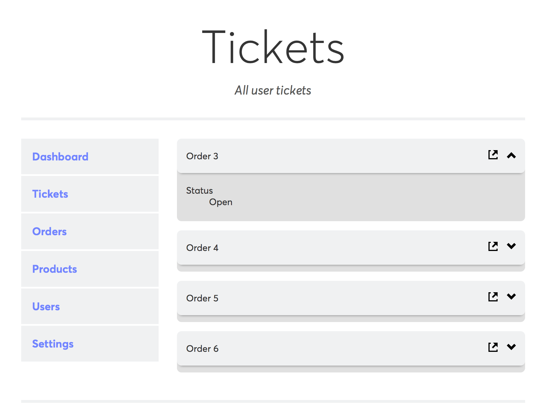
Ticketing administration even has specifically tuned components and clean interface to ensure new and existing orders are not a chore to manage. The front-end of the site reflects the same attention to detail and, of course, a clean, responsive design.