
As a designer at Brief Media, I had the opportunity to work on redesigning the web experience for Clinician's Brief, the foremost peer-reviewed veterinarian journal. Through the process, I also refactored the company's CSS and build tools. This redesign was completed simultaneously with redesigns of their print and weekly email newsletter properties.
The following summer, 2016, I designed a new digital reading experience designed to bring the browsability of print journals to the web and lay a foundation for future features.
Clinician's Brief: Summer 2015
Clinician's Brief, a peer-reviewed journal and the #1 source of information for veterinarians, underwent a large brand redesign including the print journal, email newsletters, and website. Rather than just update the branding of the site, we took the opportunity to complete a site-wide revamp of Clinician's Brief. I also took the opportunity to refactor CSS on all the company's sites in order to leave behind Sass and a swath of largely unused mixins to lean, reusable, and mobile-first CSS. This necessitated creating all-new build tool pipelines using PostCSS, Webpack, and gulp to speed development and allow sites to share code more efficiently.
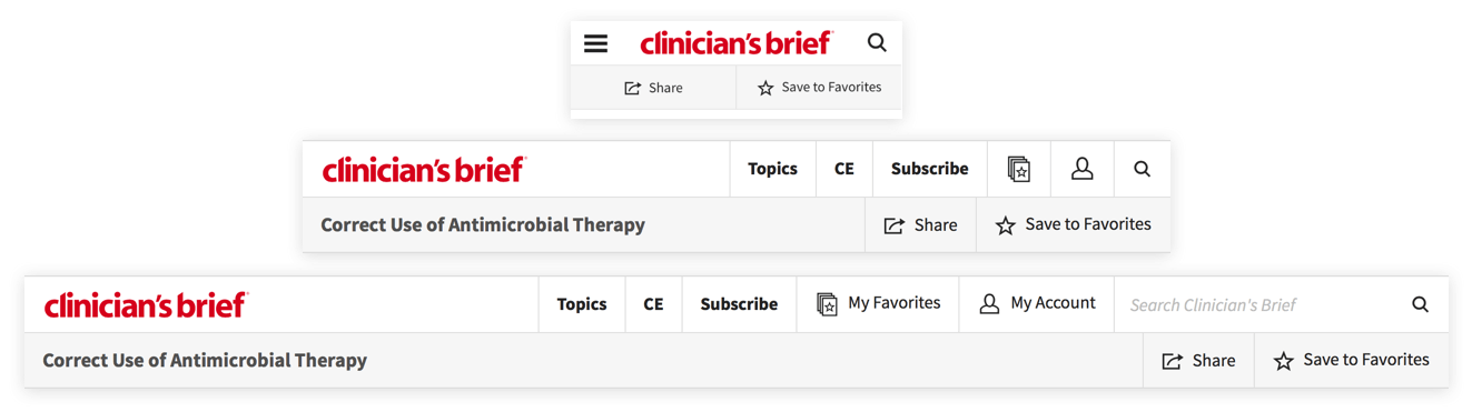
I designed and implemented an all-new header for Clinician's Brief which allows the site to be navigated much more easily and serves as a springboard for new functionality.
The old header is demonstrated above. This previous design suffered from several problems, including hiding the account sign in and creation buttons next to an ad unit. I used analytics data from users of the site and feedback from stakeholders to dramatically reduce clutter while making vital functions easier to access. A new header design that I built from concept to shipping code is shown below.
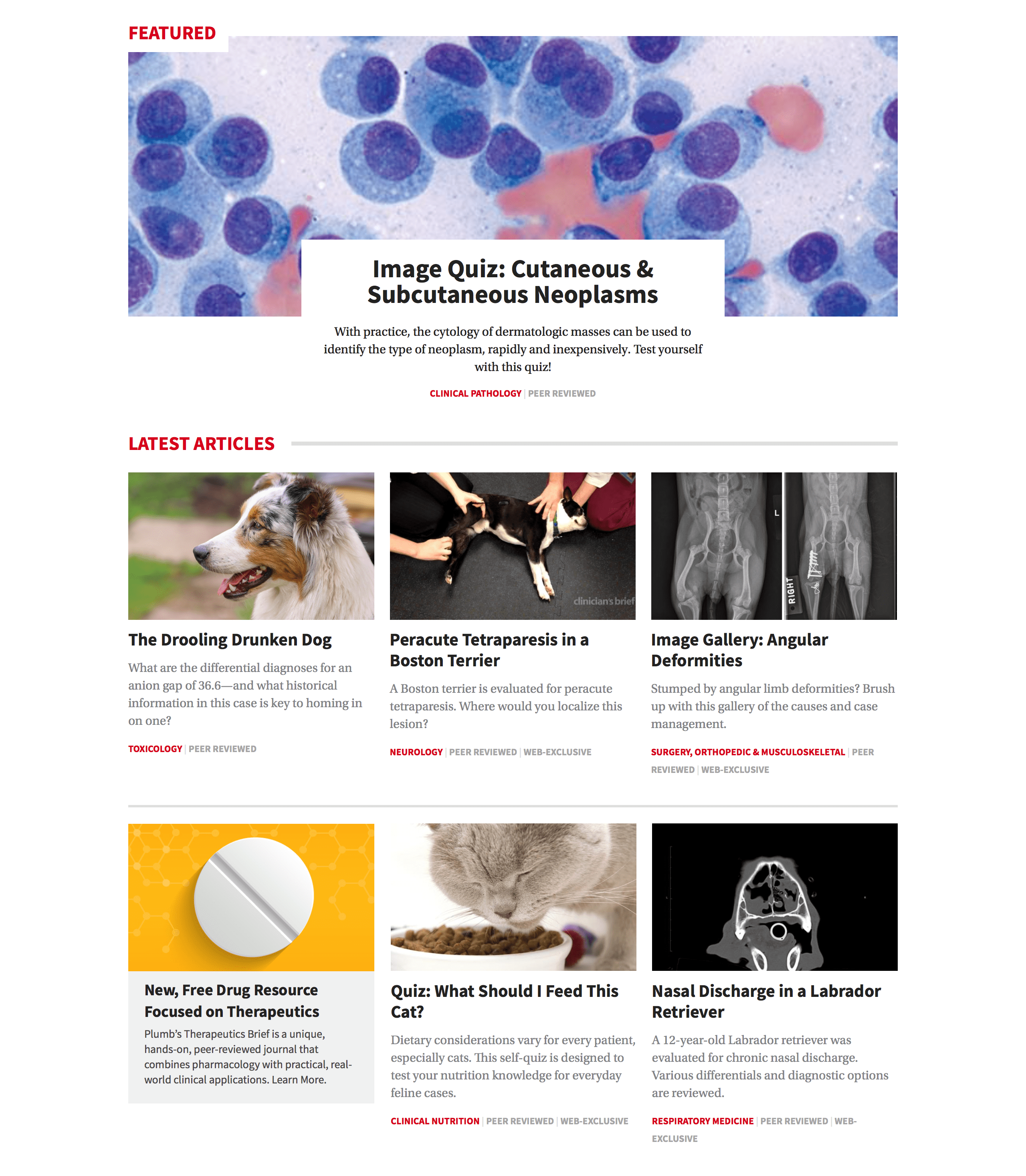
After those major phases of the redesign project, I continued to revamp the site by redesigning the homepage and article pages in order to drop the sidebar which had become mostly an un-engaging and ad-laden area of the site. I instead integrated native and display ads in the flow of the homepage sections and within articles to created a simplified reading experience and more valuable ad spots.
The refreshed design was rolled out on Veterinary Team Brief, Clinician’s Brief’s sister site, shortly thereafter along with refreshed branding.
The Clinician's Brief was selected as a finalist for two Folio: Ozzie awards in both site design and redesign. Articles on Clinician’s Brief and Veterinary Team Brief have been selected as finalists for Folio: Eddie awards.
Digital Edition: Summer 2016
I designed and prototyped a replacement for a product called Digital Edition. It is an online reading experience for Brief Media’s journals geared towards a print-like reading experience. Contrasting from the rest of the site which is has editorially curated and frequently rotated sections, this experience is static and articles follow the same order as the monthly journal. The experience to date was lacking greatly, however, as users were simply viewing PDFs in an embedded viewer on the page.
I began by gathering data on our current product’s usage and talked over business goals and future plans for the product. I also took guidance from a proof-of-concept prototype created months before the project began. Working with Adobe Experience Design and InVision, I created an interactive demo and prototype of the product so stakeholders could firmly understand the finer parts of navigating through the proposed product in mobile, tablet, and desktop environments.
I had a few goals for the product based on the data I gathered while researching design options:
- Consistent Design: I opted to keep the experience consistent from mobile through to desktop. Our data showed that the users of this product were generally digital holdouts, people that often don’t even have an account on Brief Media sites (a rarity since articles are gated and require a free account to read). If interface elements differ greatly between mobile and desktop, users will feel less confident about using the digital interface.
- Progress: In print, you have a tangible portrayal of progress as you flip through the pages of a publication. The medium of the web lacks this to a degree. Scroll bars may give some level of imprecise progress, but this hides the usually faulty assumption that users read a page top to bottom in a single sitting on a single device. In the context of peer reviewed journals, progress through an issue is likely broken up through multiple reading sessions over multiple devices. As a result, I designed a persistent status bar in the Table of Contents view so users could track their progress as they read each article in an issue.
- Planning: Getting back to an advantage of print. With print readers can easily flip through an article to gauge its length. With digital reading experiences, this process is not so simple. To combat this, I specced read time meters for each article in the main browsing and Table of Contents views.
The result is an immersive reading experience on all platforms by bringing easy browsing and place-saving as well as a more accessible experience to users.
Brief Media
I refactored and retooled the front-end of the Brief Media website to be truly mobile-first using the latest best practices in web design while also adding a style guide section for easy access to visual assets for Brief Media's collection of established brands.